Q. If, following CMOS 3.80, I’m using symbols to indicate notes to a table (asterisk, dagger, double dagger, and so forth), should the asterisk be superscripted like the other symbols?
A. A literal reading of paragraph 3.80 would suggest that asterisks, like other note references—whether numbers, letters, or symbols—should be superscripts. And superscripts are what you’ll get by default when you use the footnote feature in Microsoft Word or Adobe InDesign, further suggesting that this must be the right way to do it.
Asterisks are funny though. In many fonts, they look like superscripts even when they’re not. For example, in Source Serif 4, the Google font used for this Q&A (to match the text of the eighteenth edition of CMOS), here’s what an asterisk looks like as a superscript versus regular text (in a screenshot captured from InDesign):
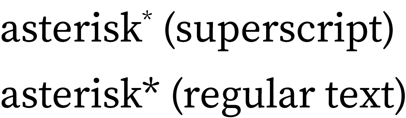
That first asterisk seems too small; the second one, formatted as regular text, looks better to us.
If your asterisks seem smaller than they should be as superscripts, try formatting them as regular text. You might consider doing the same for the daggers and double daggers, especially in the smaller font sizes that are typical in tables. (Letters and numbers, on the other hand, could be mistaken as part of the text if they’re not raised above the baseline.)
Typesetters and designers won’t always agree about what looks best for asterisks and the like, but legibility is always important. Whether you’re formatting a table (or any other text) for publication or simply editing it in Word, it’s best to make sure the note references won’t be missed.
Note: For tables, you’ll usually want to enter footnote references and their corresponding notes below the table manually instead of using the notes feature in Word or InDesign (or other program); otherwise, they’ll get mixed up with notes for the main text. See also CMOS 3.77 and 3.80.